How a system-level statechart turned into a designer-readable storyboard #
The Setup #
In a recent post I shared how I’ve been experimenting with a plain-text DSL to describe product behavior — part of a bigger effort to build a design tool that helps sketch system states before screens are involved. It’s early days, but I’m starting to see how modeling behavior upstream of Figma can clarify what a product actually does, long before deciding how it should look.
Early on, things were promising. My DSL (domain-specific language) was expressive enough to model complex UI behavior and generate statecharts with ease. I could sketch out parallel states, transitions, flags, user inputs — the whole orchestral arrangement of product logic. But then I asked a different question: what if this system could do more than describe behavior? What if it could help me (or another designer) start a design?
That’s where the story gets messy.
The Use Case #
To test this idea, I picked a focused, real-world scenario: a trial user trying to access a premium feature. It’s a common pattern — gated functionality behind a flag, only accessible after an upgrade. The logic is simple on paper: if the trial user’s flag is off, show a fallback UI; if they accept the upgrade offer, flip the flag, unlock the feature.
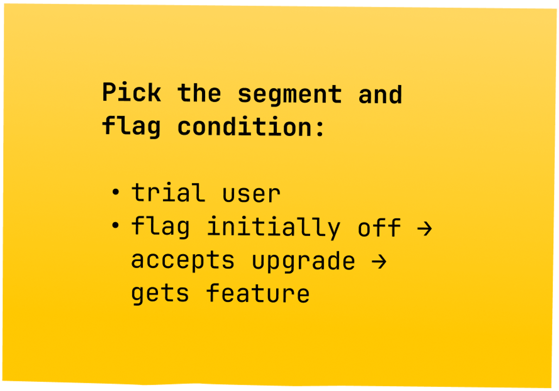
I could boil down this scenario into a single DSL line:
trial user → ShowFallback → user_action_accept → UpgradeFlow → Success → ShowFeature
First Output: The “Everything Map” #
From there, I passed the full DSL into GPT, asking it to generate a Mermaid statechart.
App
    parameters:
      user_segment: {free, trial, paid}
      feature_flag: {enabled, disabled}
      session_flag_state: current flag state during session

    Initialization*
        evaluate_flag_for_segment -> ShowAppropriateUI

    ShowAppropriateUI
        user_segment: free
            feature_flag: enabled ? -> ShowFeature : -> ShowFallback

        user_segment: trial
            feature_flag: enabled ? -> ShowFeature : -> ShowFallback

        user_segment: paid
            feature_flag: enabled ? -> ShowFeature : -> ShowFallback

        user_segment: unknown
            -> ShowFallback

    ShowFeature
        UIState*
            user_action -> FeatureInteraction
            flag_change_mid_session -> HandleFlagChange

    ShowFallback
        UIState*
            user_action -> RequestUpgrade
            flag_change_mid_session -> HandleFlagChange

    FeatureInteraction
        normal_use*
            user_action -> normal_use
            flag_change_mid_session -> HandleFlagChange

    RequestUpgrade
        prompt_shown*
            user_action_accept -> UpgradeFlow
            user_action_dismiss -> ShowFallback

    HandleFlagChange
        flag_now_enabled*
            -> ShowFeature
        flag_now_disabled
            -> ShowFallback
        flag_error
            -> ShowError

    UpgradeFlow
        step1*
            user_submits_payment -> Success
            user_cancels -> ShowFallback

        Success
            -> ShowFeature
The machine was surprisingly capable. It spat out a valid diagram that charted every condition and transition.
stateDiagram-v2
    [*] --> App
    state App {
        [*] --> Initialization
        Initialization --> ShowAppropriateUI

        state ShowAppropriateUI {
            state "User: Free" as user_free
            state "User: Trial" as user_trial
            state "User: Paid" as user_paid
            state "User: Unknown" as user_unknown

            user_free --> ShowFeature: feature_flag=enabled
            user_free --> ShowFallback: feature_flag=disabled
            user_trial --> ShowFeature: feature_flag=enabled
            user_trial --> ShowFallback: feature_flag=disabled
            user_paid --> ShowFeature: feature_flag=enabled
            user_paid --> ShowFallback: feature_flag=disabled
            user_unknown --> ShowFallback
        }

        state ShowFeature {
            [*] --> UIState
            UIState --> FeatureInteraction: user_action
            UIState --> HandleFlagChange: flag_change_mid_session
        }

        state ShowFallback {
            [*] --> UIState
            UIState --> RequestUpgrade: user_action
            UIState --> HandleFlagChange: flag_change_mid_session
        }

        state FeatureInteraction {
            [*] --> normal_use
            normal_use --> normal_use: user_action
            normal_use --> HandleFlagChange: flag_change_mid_session
        }

        state RequestUpgrade {
            [*] --> prompt_shown
            prompt_shown --> UpgradeFlow: user_action_accept
            prompt_shown --> ShowFallback: user_action_dismiss
        }

        state HandleFlagChange {
            state "Flag Now Enabled" as flag_now_enabled
            state "Flag Now Disabled" as flag_now_disabled
            state "Flag Error" as flag_error

            flag_now_enabled --> ShowFeature
            flag_now_disabled --> ShowFallback
            flag_error --> ShowError
        }

        state UpgradeFlow {
            [*] --> step1
            step1 --> Success: user_submits_payment
            step1 --> ShowFallback: user_cancels
            Success --> ShowFeature
        }
    }
Then I converted that into a flowchart via Whimsical Diagrams GPT, hoping to see the flow visually unfold. What came out was… comprehensive. Exhaustive, even. The diagram captured every possible state, condition, and system response. Redirects. Fallbacks. User actions. Flag propagation. Success and failure branches.
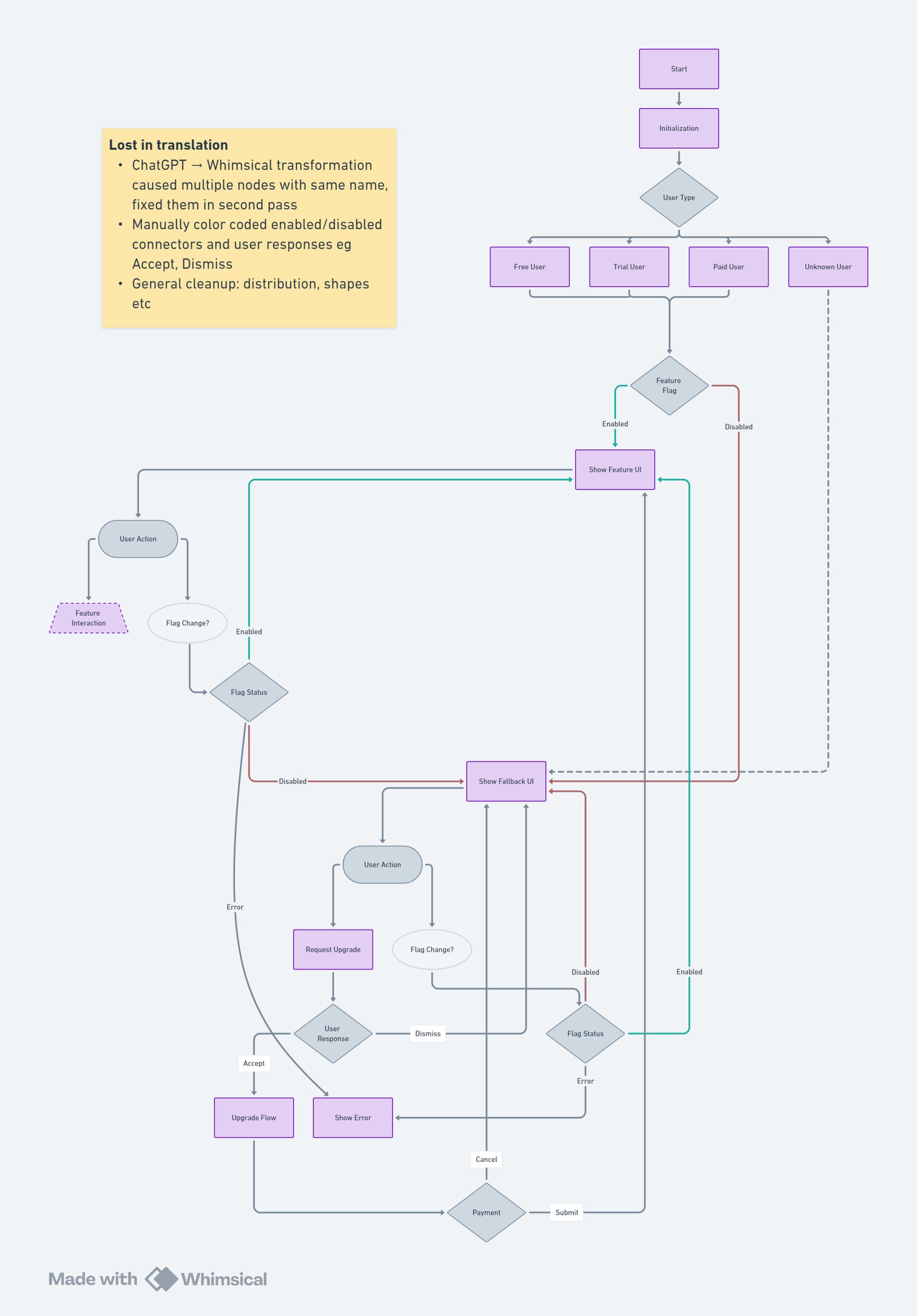
It was technically correct — and totally unreadable as a design artifact. Looking at it felt like trying to plan a road trip by staring at a satellite image of the entire continent. I could see everything… and nothing. The journey I wanted to trace — a single trial user discovering a feature — was lost in the forest of logic.
This wasn’t just a diagram issue — it was a symptom of the state explosion problem. Even small flows can produce a combinatorial mess when every possibility is charted. I didn’t need all possible states. I needed one clear path.
Manual Clean-Up: The Happy Path #
So I stepped back and did what designers often do when prototypes stop being useful — I grabbed the metaphorical scissors — that is, I manually trimmed the diagram down to just one flow.
The happy path.
Trial user, flag off, accepts upgrade, flag on, feature unlocked. No retries, no edge cases, no error handling. Just the core experience a designer would start with.
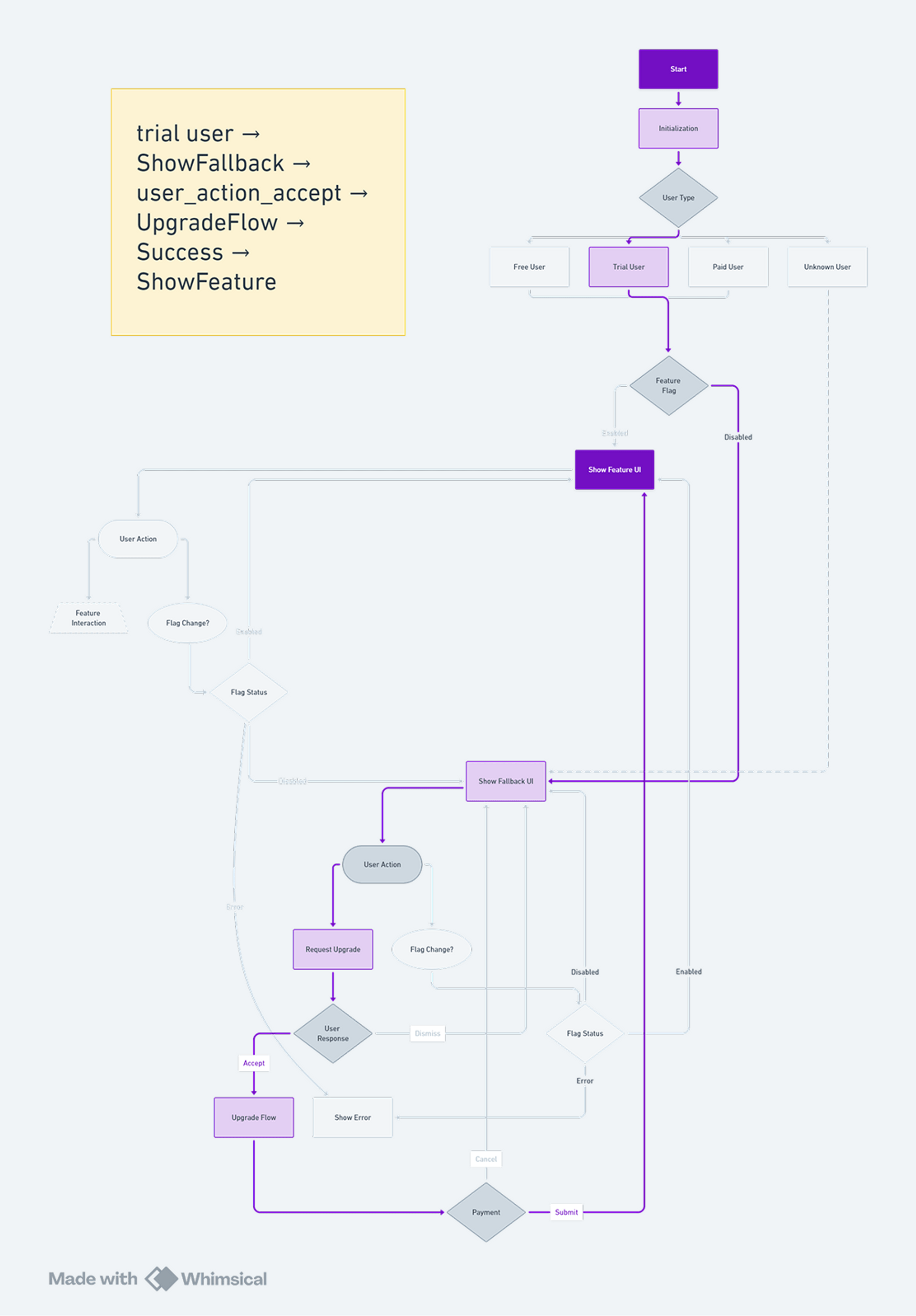
With the noise removed, I could see the user story again. The decision points turned back into moments. System logic faded into the background. What remained was something I could actually design — a storyboard of what’s supposed to happen.
Swimlanes: Clarity by Role #
To make it even clearer, I reorganized the happy path into three horizontal swimlanes:
- What the system decides (flag checks, redirects)
- What the user sees (UIs, prompts)
- What the user does (clicks, approvals)
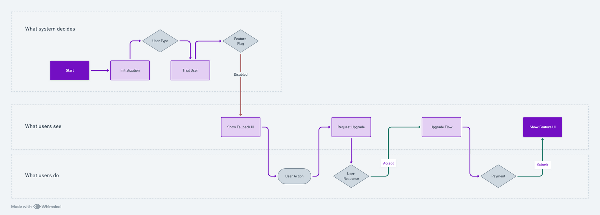
This tiny layout change had a big cognitive effect. The flow didn’t just move from left to right — it now belonged to different layers of responsibility. It echoed how I think when designing: balancing backend logic, UI events, and user behavior in parallel.
More importantly, it felt like something I could hand off to a design tool. A layout. A scaffold. A sequence of intentional moments.
Takeaway #
That shift — from modeling all possible states to tracing a narrative through them — was the breakthrough.
I started this exploration wanting to feed behavior logic into a visual design process. What I found was something quieter, and maybe more essential: a way to distill interaction complexity into a visual grammar that designers can actually work with.
System diagrams are still useful — especially for engineers and architects. But when you're trying to start design, when you're figuring out what a user should experience, you don’t want the whole map. You want the clearest path forward.
And sometimes, to find that movement, you have to throw away 90% of the map.
Next Steps #
Here’s the idea: start with a DSL that describes the whole system. Generate the full statechart. Pick the journey you care about. Strip away everything else until you have a clean, simple flow. Then use that to scaffold the Figma file — artboards, notes, and all.
I usually get lost in these big, sprawling state machines. So I want something that cuts through the clutter. A “Distiller” that makes complicated state logic easy for designers to use. That’s what I’m aiming for next.
🙏🙏🙏
Since you've made it this far, sharing this article on your favorite social media network would be highly appreciated 💖! For feedback, please ping me on Twitter.
Published